Velvet is having a star moment in 2025 and we’re all very excited about it. From outfits to table runners and wedding invitations, velvet brings a rich feel and texture that instantly levels up your vibe. It’s lush, luxe, and totally unforgettable. But what really makes a velvet invite stand out? It’s the color.
Velvet doesn’t play well with every shade. It shines with deep tones, moody hues, and colors that love a little drama. If you’re leaning toward velvet wedding stationery this year, your color palette deserves extra thought.
Here are the hottest velvet invitation color palettes taking over 2025, with tips on how to make them pop.
Why Velvet Invitations Are Trending
Velvet is tactile but dominating in presence. It provides a moment of instant sophistication and texture without requiring layers of over-design. With the world of minimal wedding style, velvet is the “quiet luxury” everyone’s looking for. It’s particularly great in cooler seasons, high-end venues, or for those couples who desire that wow without being too extra.
And then there’s how velvet radiates light. It’s nothing less than chef’s kiss.
2025’s Top Velvet Invitation Color Palettes
Are you also intrigued by the interesting profile of velvet invitations? Well, it’s not your fault. Whether you choose velvet wedding cards or birthday invitations with a velvet texture, every occasion can be dolled up with velvet invitations.
Here are the top velvet color palettes that are trending in 2025 –
1. Deep Emerald + Antique Gold
This is all about classic sophistication. Emerald adds luxurious depth, while antique gold details—such as foil stamping or wax seals—give an elegant sheen. It is stunning for evening weddings, castle weddings, or cold winter weddings with a dash of drama.
Where to apply it: Velvet card base in emerald with gold calligraphy, gold envelope liner, or ribbon bow.
2. Dusty Rose + Mauve
Soft but dramatic, this color scheme is romantic with attitude. Dusty rose velvet has a vintage, dreamy quality, and mauve hues provide depth. It is great for fall weddings, vineyard receptions, or couples seeking a muted, contemporary look.
Pro tip: Employ tonal layering—dusty rose base, mauve ink, and blush wax seal.
3. Midnight Blue + Silver Foil
This one’s for the fearless. Midnight blue velvet is dramatic and enigmatic, and silver foil sparkles like fairy dust. It is ideal for winter weddings, New Year’s Eve celebrations, or black-tie affairs.
Pair it with: White ink calligraphy, metallic liner, and clean typography to maximize contrast.
4. Burnt Sienna + Terracotta
Warm, earthy, and richly timely, these hues complement velvet’s texture and feel grounding yet chic. This color scheme is particularly favorite for boho or desert-themed weddings with plenty of dried flowers and warm lighting.
Layer with: Cream envelopes, terracotta ink, or raw-edge paper embellishments.
5. Charcoal Grey + Champagne
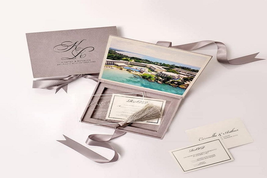
Subtle, contemporary, and streamlined. Charcoal velvet provides a neutral foundation that feels luxurious anyway, but the champagne adds softness and light. Perfect for industrial spaces or minimalist wedding concepts that also desire a luxe bite.
Pair it with: Monogram embossing, champagne ribbon, or vellum overlays.
6. Forest Green + Ivory
Clean, elegant, and extremely 2025, this piece combines forest green velvet with ivory text for a striking but harmonious contrast. It’s a slick win if you’re looking for something classic but a little unconventional.
Make it pop: Ivory card inserts, botanical illustrations, or textured envelope liners.
7. Burgundy + Rose Gold
Burgundy velvet is never out of fashion, and paired with rose gold foil or detail, it is romantic, opulent, and intense. This is a default palette for winter and late fall weddings or any occasion with formal sophistication.
Top off the look: Rose gold calligraphy, velvet belly bands, or coordinating RSVP cards in flat tones.
Tips to Work with Velvet Invitations
Velvet feels luxe, but it’s not without a couple of quirks. If you’d like your velvet invitation cards to look polished and your anniversary cards premium and save-the-date invitations practical, consider these things before you get started.
1. Let the texture be in charge
Velvet is already doing a lot of the heavy work. It’s soft, luxurious, and striking all by itself. So rather than overloading your design with complicated patterns or too much design element, go for minimalism. Simple lines, straightforward typography, and strategic white space allow the velvet to be the star. Less really is more here.
2. Make your print method count
Printing velvet is different from printing ordinary paper. Not all ink adheres to that soft, fuzzy material. What is your best option? Screen printing or foil stamping. Both of these place a layer over the fabric and provide your text or image with a high-contrast, hard look. Embossing and debossing also work well if you are aiming for texture-on-texture.
3. Don’t be afraid to mix materials
Velvet prefers companionship. It coordinates well with handmade cotton paper, vellum overlays, metallic liners, acrylic accents, and wax seals. Combining textures achieves that luxurious, editorial feel without requiring flashy colors or additional embellishments. Consider velvet belly band + vellum overlay + handmade RSVP card = gorgeous.
4. Consider handling and mailing
Velvet is a bit more—literally. It weighs more and is bulky, which may impact postage and packaging. If you are sending these stunners in the mail, you may require an additional thick envelope or a box-style mailer to safeguard the texture. It’s also wise to hand-cancel your invitations at the post office to prevent damage.
5. Order samples first
Velvet appears differently in varied lighting. That rich burgundy may appear warm and plush in the studio but almost brown under yellow light. Always order a sample of your desired color and print so you can touch, feel, and see precisely what your guests will receive. Believe us—it’s well worth that extra measure.
6. Observe your color scheme
Certain colors simply look better on velvet. Rich jewel colors, warm earth tones, and high-contrast neutrals are always safe bets. Pastel colors may become washed out or dusty sometimes, so if you’re considering blush or pale lilac, be careful with your material selection and lighting.
Conclusion
Velvet invitations are not just stationery—they’re a statement. The color scheme you go with can totally change the ambiance, from romantic and soft to luxurious and bold.
In 2025, it’s all about the deep tones, metallic accents, and textured luxury. Whether you’re going moody in midnight blue or warm with terracotta, velvet gives your invitations the kind of presence that people notice.
When you’re ready to turn your color palette into a work of art, Duallush is here for you. With our online platform to order invitation cards online, designing high-end, one-of-a-kind wedding invitations and beyond is a breeze. From texture-driven templates to color combination customization, Duallush assists you in crafting something that’s not just stunning—it’s yours.
Discover velvet designs, experiment with color, and make something truly memorable—all in one spot.

